The Search View
The search view displays data in a table with functions for adding, editing, deleting and filtering (search) the data. The search views can be used only for displaying data (read-only) or for displaying and modifying data.
Functions of the search view
- Displaying the data as a table
- Filtering the data
- Selection: one by one, all visible rows, all rows that match a filter
- Add rows
- Edit, Delete and Custom actions on selected rows
- Paginating rows
- Execute global custom actions
- Auto-refresh when data changes (only monitors locally initialized changes)
Overview
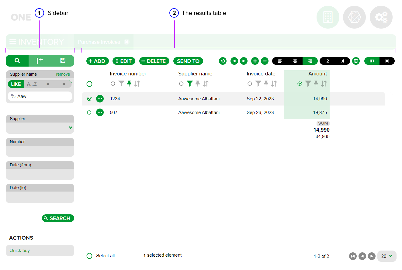
- Sidebar - the sidebar of functionalities;
- The results table - the results table that displays the data.
The results table
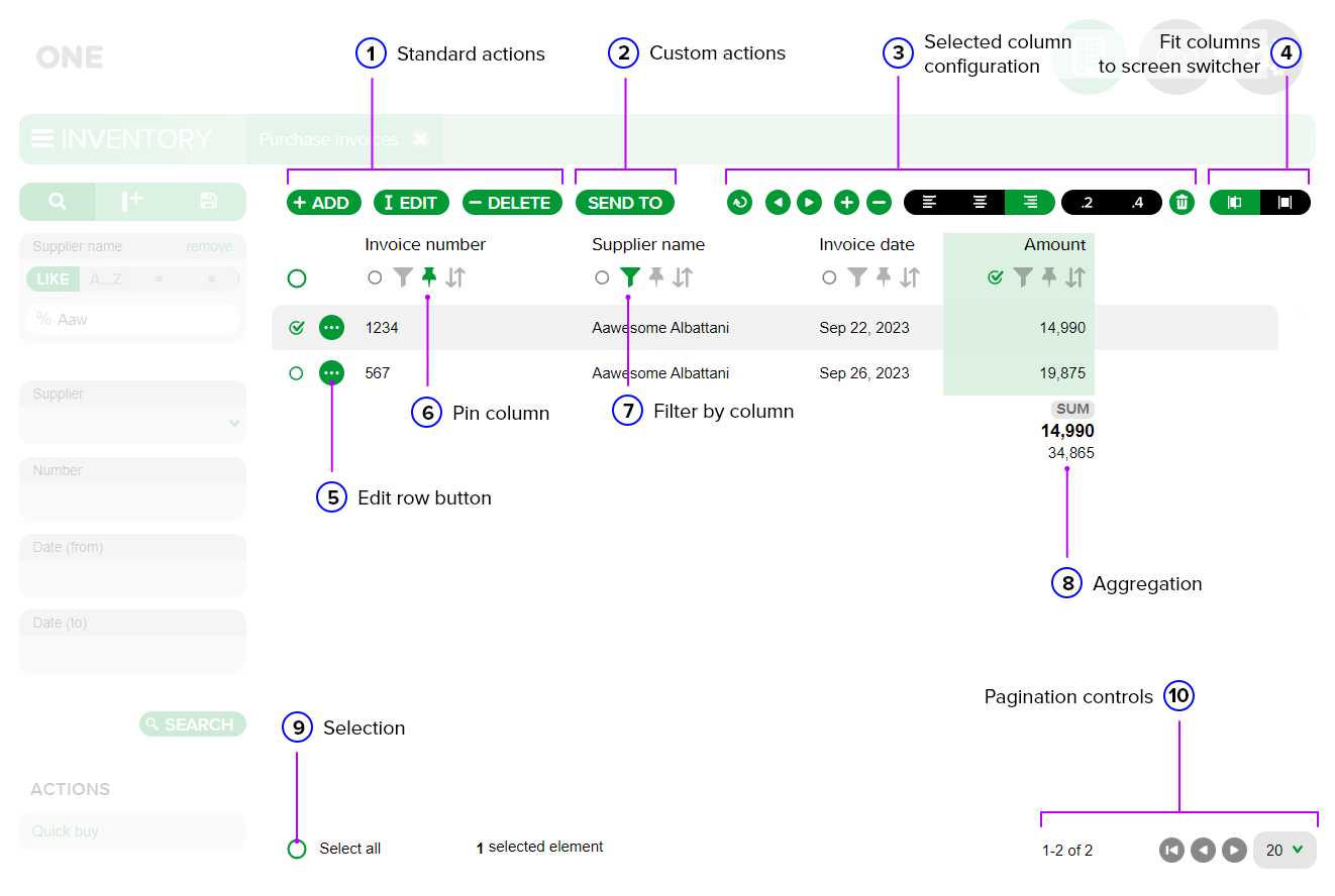
Standard actions - standard actions that are displayed when selecting a record in the table individually or when selecting multiple records by clicking on the circle on the left side of the row. A row is selected when the circle has an active checkmark. After selection, the following buttons are displayed by default:
- +ADD: displayed by default, without the need to select a row, but the button remains active while a record is selected. It is used to open the form for adding a new record;
- EDIT: used individually at the record level to open the edit tab of an existing record;
- DELETE: used to delete a selected record or multiple records simultaneously from the results table.
Custom actions - custom actions that allow an operation to be performed on a single or multiple selected records (e.g. SEND TO).
Selected column configuration - the configurations available for the selected column. A column in the table is selected by clicking on the circle on the left side of the filter funnel, located under the column name. The column is selected when the circle has an active check mark and its selection is highlighted by the default color of the current module.
After selecting a column, the following configurations are displayed:
- Undo button - cancels the column selection. Canceling the selection of a column can also be done by clicking on the checked circle again;
- Column repositioning buttons in the table - used to move the selected column to the left or right;
- Column resizing buttons. The “+” button increases the horizontal space occupied by the selected column and the “-” button decreases it;
- Text alignment buttons - used to align the text in the selected column to the left, center, or right. The currently active text alignment button is highlighted by the default color of the application module; If the selected column displays numeric values for the table records, you will see two additional buttons to select the number of decimal places you want to display (“.2” for 2 decimal places and “.4” for 4 decimal places);
- Delete button - used to delete the selected column from the results table.
Fit columns to screen switcher/Compact/Expanded mode switch buttons - used to collapse the columns in the table, displaying them in a compact (left button) or expanded (right button) mode.
Open button (circle with three dots) - used to open the record editing tab (edit view).
Pin column - used to pin a column. Pinning becomes active when the pin changes color from gray to the default color of the module. This functionality is useful when the results table includes multiple columns. After pinning a column, it remains displayed on the screen even if the user scrolls horizontally in the table to view the other columns.
Filter by column - filtering at the column level. Filtering is active when the funnel changes color from gray to the default color of the module.
Aggregation - used to apply an aggregation function to the selected column of numeric values.
Selection - is used to select all records in the table. Check the Select all circle to activate the selection. You can also check the circle located under the +ADD button to obtain the same result (selecting all records in the table). If filters were applied to the data prior to the total selection, the “Select all items that match the filter, including the ones that are not shown” button will be displayed at the bottom of the screen, to select including the records that match the applied filter but that are not displayed on the current page due to the number of rows set for display on a single page.
Pagination controls - used to set the number of rows displayed on a single page (20 by default) and for navigating between pages.
The sidebar
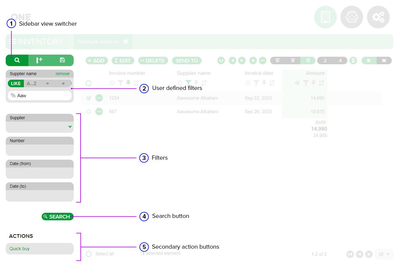
Sidebar view switcher - allows changing the side menu of operations that can be performed at the results table level. The default view that is displayed when accessing a results table section is the SEARCH view.
ADD COLUMN view (middle button) - is used to add a new column to the results table and for column-level aggregations.
SAVED SETTINGS view - is used to save a copy of the view created after adding columns to the results table. The saved setting will be displayed in the list.
Note: By default, new columns are not permanently saved in the results table in the Search view for subsequent accesses after closing the tab.
User defined filters - are automatically displayed when a column-level filter is applied by the user.
Filters - default filters displayed after implementation.
SEARCH button - is used after filling in user-defined filters or after filling in default filter fields to apply them at the results table level. You can also use the ENTER key on the keyboard to initiate the search.
Secondary action buttons - are displayed after implementing and adding an action to the Search view. They are displayed in the lower left corner of the screen when the section is opened.
Customizing the view
Add Column Side View
Allows adding a new column to the results table.
Columns can be moved, resized, or reordered by selecting one or more columns and by using the toolbar.

New columns can be added by using the side bar.

Saved Settings side view
Used to save a customized display of the results table.
Views can be saved by using the side bar.

Filtering
Within the One Framework platform, filtering can be done in the following ways:
- Column-level filtering - within the results table, choose the column by which you want to apply a filter and use the filter funnel;

- Default filters - are implemented by the developer and displayed by default in the search sidebar when opening the search view.

Sorting
Sorting is done by using the header cell filter button.

The data in each column can be sorted by using the sort button (the icon with the two bidirectional arrows). If the icon is gray, no sorting is applied to the respective column.
By default, the data in the results table is displayed in the order in which they were added. Two types of sorting can be performed at the column level using this button located under the column name in the tool area:
- Ascending sort - activated by clicking on the sort button;
- Descending sort - activated by clicking on the sort button twice in a row.
For more information on search views see Documentation → Develop App → Search views.